In short
This is a story about how we improved our key commerce KPIs through a systemic redesign of our PLPs
Source: FullStory dashboard, YoY, sessions that visited any PLP
Team
Manu Garzaron - Product Design Lead
Sarah Higgins - User Research
Chelsea Lensing - Product Designer
Ted Adriance - Engineering Lead
Eduardo Gonzalez - Product Owner
Stakeholders
Merchandisers
Marketers
Web Producers
Digital Designers
Regional Managers
Physical Product Line Managers
Deliverables
Design components and guidelines for designers
Prototypes for user testing
Discovery synthesis document
Design and technical specification documents for stakeholders
Time and Place
Patagonia Headquarters, Ventura, CA
Apr - Dec 2023
Our PLP redesign process
Challenges
Variability
Patagonia customers browsing our website often faced inconsistency and distraction due to a lack of uniformity across over 1,200 product listing pages. This variability wasn't tailored to page type but stemmed from a fragmented approach, where different teams implemented changes to meet their own specific needs. As a result, the shopping experience suffered from inconsistencies that detracted from customer focus and ease of navigation.
Navigation, Comparison and Filtering
Additionally, users faced challenges with navigating through listing pages and finding relevant products, as there wasn’t a straightforward way to browse, filter, or compare items effectively.
LIFESTYLE PHOTOGRAPHY
As our primary medium for brand expression, our imagery held significant potential for improvement, both in consistency and alignment with Patagonia's values.
This inconsistency, combined with distractions, weak brand representation, and inadequate product discovery tools, led to a confusing and frustrating user experience. As a result, key metrics like bounce rate, add-to-cart rate, and conversion rate suffered.
With over 1,200 product listing pages, Patagonia customers often encountered inconsistencies that distracted them from their primary goal: easily finding and selecting the products they needed. This lack of uniform product guidance and intuitive navigation hindered their shopping experience.
Discovery
Our discovery phase involved multiple methods to build a comprehensive understanding of our product listing page (PLP) challenges:
Heuristic Evaluation: We conducted an expert review of our PLPs, noting key usability and design issues.
User Feedback: Through interviews with 20 users, we gained insights into their shopping needs and behaviors, particularly around product browsing.
Data Analysis: We examined data from Adobe Analytics, Quantum Metrics, and previous A/B tests to identify patterns in what was working and what wasn’t.
Stakeholder Input: We consulted with customer experience experts, the Merchandising team, the Technical Product team, and regional teams to gather cross-functional insights.
Landscape Analysis: To inspire solutions, we reviewed competitor sites, leading e-commerce platforms, and specialist reports from Baymard and Nielsen Norman."
A clip from one of our UserTesting sessions. 45% of participants struggled to differentiate between products, often defaulting to the cheapest option. Beyond price, positive reviews and high ratings emerged as strong purchase motivators for both male and female participants.
Data Analysis - example using Quantum Metrics
Lanscape Analysis - How we went out in the wild to see how others were solving for common problems
Landscape Analysis - How we went out in the wild to see how others were solving for common problems
Opportunity
Our hypothesis was that introducing a structured system of templates could establish guardrails to prevent excessive variation between pages. By strategically leveraging existing features—and enhancing them with new tools like filters, product category tabs, tags, a product comparison tool, and expanded refinement options—we aimed to create a more cohesive browsing experience, helping customers find products that truly matched their interests
General Improvement: PLP Templates
We proposed a templating system designed to balance consistency across pages with the flexibility needed for stakeholders to address specific goals. To achieve this, we conducted a card-sorting exercise with our top 100 pages, identifying six key categories that would encompass all primary needs. Within each category, we defined specific functionality and components, tailoring the level of flexibility according to the required variability
Overview - Decision process when determining the template type for a new page
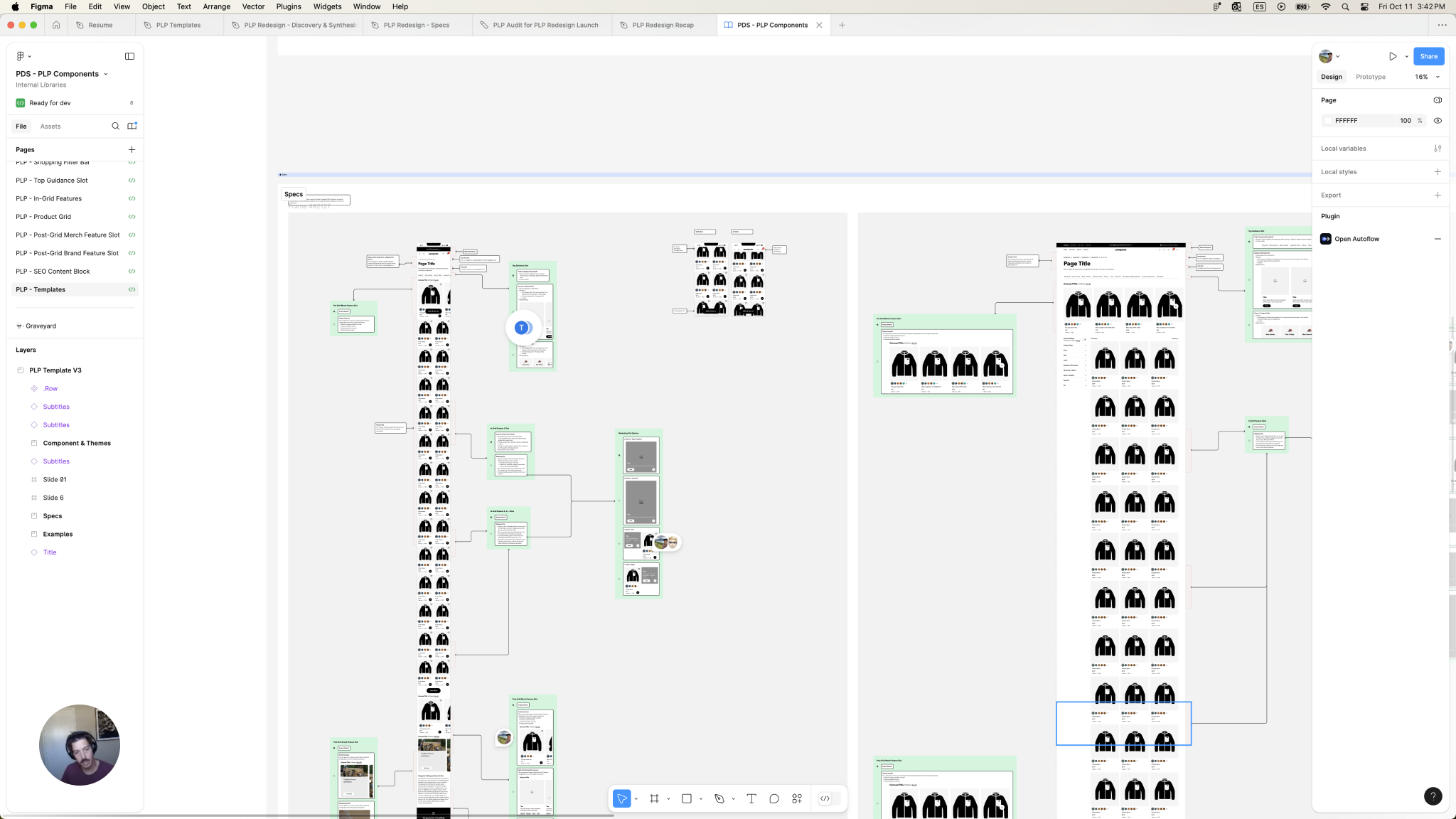
Specs - Screenshot of Design documentation with options per ‘slot’
Shop Alls - Example of one of the six PLP template types
Video tutorials - I used video as a way to communicate internally the specifications of the new system of templates. This had a great outreach to stakeholders and regions, and we received very positive and constructive feedback for us to improve it even further.
Enhancement: In Grid Heros
An example of the brand and lifestyle photography issues was how we initially placed hero images at the top of PLPs. To boost commerce KPIs, we had reduced hero image height, which did improve KPIs but compromised the quality of our photography. This ‘slim’ hero format led to several issues:
Content Challenges: Adapting to the new format was labor-intensive, as producers had to QA across numerous assets on the site, and content designers found it difficult to crop photos for future use.
Brand Impact: This format clashed with the photography philosophy of our editors, limiting the intended visual impact of our lifestyle imagery.
User Experience: While metrics improved, the user experience suffered. (See an example on the right of a user commenting on the issue.)
After gathering insights from users and stakeholders, we decided to integrate hero images directly within the product grid. This new placement allowed for flexible settings and optimized aspect ratios, enhancing our photography's visual impact without sacrificing KPIs.
As part of finding the solution, we made sure we were accounting for the POVs of not only our customers but also all the internal stakeholders
As a solution moved the PLP heros to the grid, setting up different setting options, making sure the aspect ratios were going to be more favorable to our photos
Enhancement: Product Tiles
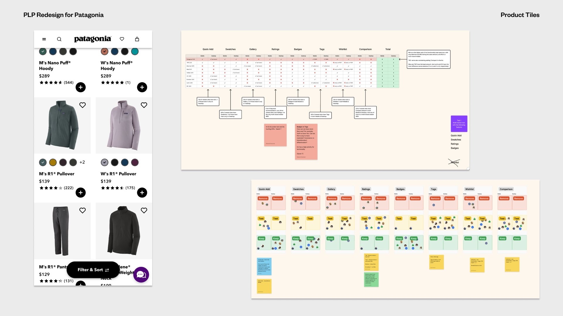
In our evaluation of product tiles, we compiled a comprehensive list of available features and compared them with those used by competitors and reference sites. To gather user insights, we conducted usability tests focusing on specific features such as badges and tags.
We then held workshops with researchers, developers, and product managers to establish a strategic approach to implementing these features. This highlighted a common tension between enhancing user experience and meeting commerce KPIs; designers aimed to simplify the experience, while PMs and developers were focused on driving sales metrics.
During discussions with our regional managers in Europe, we discovered a significant difference in how badges were utilized. While U.S. teams primarily used badges for commerce-related callouts like "Sale" or "New," European teams employed them to highlight technical features, such as material. To address this, we conducted usability and A/B tests and introduced tags to accommodate both types of callouts, which resulted in a successful outcome.
We run workshops with the researchers, developers and product managers to decide on the strategy around them and how we would implement it. This is one of those KPIs vs Experience situations where we designers where trying to make a case to simplify the experience, and PMs and devs where leaning more on commerce KPIs.
While talking to our regional managers in EU, we discovered that they were using the Badges differently than in the US. They were using those to call out technical features like material, while we used them for commerce callouts like ‘Sale’ or ‘New’. We did some usability and A/B tests and implemented Tags to make space for both types of callouts, with great success
New Feature: Product Comparison Tool
A quick win for our team was the implementation of the out-of-the-box Product Comparison tool from Salesforce Commerce Cloud. Collaborating closely with our engineers, we analyzed the documentation and tailored the front-end integration to align with our Design System's language. The launch was a success, and we are currently working on a more customized mobile experience.
Product Comparison Feature Impact Stats:
From November 9 to 16, over 2,200 sessions utilized the compare feature. Remarkably, more than 60% of these sessions led directly to a product detail page (PDP) from the compare page, indicating a strong progression in the customer journey.
During the same period, the overall conversion rate (CVR) for PLPs was approximately 2%, while PDPs achieved around 2.5%. In contrast, sessions utilizing the compare feature saw a CVR of over 5%, and sessions that viewed a PDP from the compare page achieved a conversion rate exceeding 7%.
These results underscore the effectiveness of the comparison tool in enhancing user engagement and driving conversions.
From Salesforce CC to Patagonia Design System documentation in Figma
Conclusion
This project was a lengthy journey filled with numerous improvements and challenges. However, it fostered growth within our team and enhanced our collaboration toward a shared goal: creating a better digital product for our customers. Here are some key takeaways from the experience:
‘Hot Potato’ Approach: A collaborative, iterative process proved more effective than a linear handoff. We often found ourselves committing to design directions that turned out to be unfeasible. Regular touchpoints and collaboration led to more productive outcomes in the long run.
Honor the Story: We learned to embrace storytelling in our design process. By applying our Product Design philosophies, we shifted our perspective on the website from merely a marketing tool to a dynamic digital product that tells a story.
Design is Never Final: We adopted the mindset of viewing our design as a living entity that requires ongoing nurturing. Continuous improvement is essential to adapt to evolving user needs, business goals, and technical constraints.
Ultimately, this project underscored the importance of collaboration, storytelling, and adaptability in delivering a successful digital experience.


